
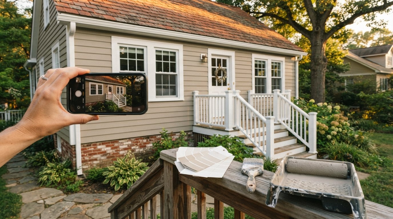
How to Choose Exterior Paint Colors for Home
A practical framework for how to choose exterior paint colors for home, from fixed elements and undertones to sampling and resale value.
By Chelsea Kris
Learn more about Exterior Painting for guides, costs, and what to expect.
Compare Exterior Painting Pros Near You

Enter your ZIP code to compare top-rated local professionals and request free quotes.
A fresh coat of exterior paint is one of the highest return on investment upgrades a homeowner can make, yet the decision often stalls before a single brush is dipped. The reason is simple: exterior color is public. Unlike a bedroom accent wall, your facade greets neighbors, guests, and potential buyers every day. Get it right and your home looks intentional, well maintained, and valuable. Get it wrong and the result can feel jarring for a decade. This guide walks through how to choose exterior paint colors for home with a practical, confidence building framework that accounts for architecture, fixed elements, lighting, and neighborhood context.
Start With the Elements You Cannot Change
Before browsing color chips, take inventory of the permanent features that will share the stage with your new paint. Roof shingles, brick, stone veneer, driveway material, and even the color of neighboring homes all impose limits on what will look harmonious. A warm terracotta roof, for example, fights with cool gray siding, while a charcoal roof flatters nearly any body color you place beneath it.
Walk your property at different times of day and photograph the fixed elements in natural light. Note the undertones: is the brick reddish, orange, or brown? Does the stone lean cool gray or warm tan? These observations become your filter. Any paint color you consider should either complement or intentionally contrast with these undertones.
This step also protects your budget. Repainting a brick exterior or replacing a roof to match a new color scheme costs far more than selecting a compatible paint from the start. Homeowners planning broader exterior work, such as siding replacement or window upgrades, should coordinate those projects with the paint schedule so the palette is decided once, not twice.
Understand Undertones and the Three Color Roles
Every exterior palette has three jobs to fill: the body color covers the majority of the facade, the trim color frames windows and doors, and the accent color highlights entry doors, shutters, or gables. Thinking in these roles prevents the common mistake of choosing three colors that compete rather than cooperate.
Undertones matter more than the color name on the label. A paint chip labeled "greige" can read warm and inviting on one house and muddy and flat on another depending on the underlying pigment. Warm undertones (red, yellow, orange) pair naturally with brick, wood, and stone. Cool undertones (blue, green, violet) suit modern architecture, metal roofs, and gray palettes. When in doubt, sample the color on multiple sides of the house and observe it at morning, noon, and dusk.
Here is a simple ratio to keep proportions balanced:
- Body: 60 to 70 percent of the visible surface, usually a neutral or muted tone.
- Trim: 20 to 30 percent, often white, cream, or a deeper shade of the body color.
- Accent: 5 to 10 percent, reserved for the front door, shutters, or architectural details.
Following this ratio keeps the facade from feeling top heavy or busy and gives the eye a clear place to rest. It also makes the entry door, the natural focal point, stand out without shouting.
Match the Palette to Your Architecture
Architectural style offers strong clues about which palettes will feel authentic. A Colonial Revival home rarely looks right in neon accents, and a midcentury modern ranch can look dated under ornate Victorian color combinations. Aligning color with style signals that the home is well understood and well cared for, which is exactly the impression you want to project.
Consider these pairings as starting points:
- Craftsman: Earthy greens, browns, and muted golds with cream trim and a deep accent door.
- Colonial: Classic whites, soft grays, and navy or black shutters with a red or brass toned door.
- Modern: Charcoal, graphite, and warm white with black window frames and a natural wood accent.
- Mediterranean: Stucco whites, warm beiges, and terracotta accents that echo clay tile roofs.
- Victorian: Three or more historically accurate colors with a bold door and detailed trim.
Beyond style, check whether your neighborhood has a homeowners association with approved color lists. Many HOAs publish palettes, and violating them can lead to repainting at your own expense. Even without formal rules, scanning nearby homes helps you choose a color that feels fresh rather than out of place.
Test Colors in Real Light Before Committing
Paint chips are printed on paper, not siding, and paper reflects light differently than stucco, wood, or fiber cement. The only reliable test is a physical sample applied to the actual surface. Paint large swatches, at least two feet square, on at least two sides of the house, and live with them for several days.
Follow this sequence to avoid expensive mistakes:
- Narrow your options to three or four candidate colors based on architecture and fixed elements.
- Purchase sample pots and paint swatches directly on the siding, not on poster board.
- Observe each swatch in morning, afternoon, and evening light, and on cloudy and sunny days.
- Compare the swatches against the roof, driveway, and any stone or brick that will remain.
- Ask a neighbor or a painting professional for an honest second opinion before finalizing.
This process takes a week but prevents the most common and costly exterior painting regret: a color that looked perfect in the store and wrong on the house. If you are working with a professional crew, ask whether they include color consultation, many do, and their experience with local homes can shortcut the sampling stage.
Factor In Climate, Sun Exposure, and Fading
Sun exposure varies dramatically from one side of a house to another. South and west facing walls receive intense light that can wash out pale colors and accelerate fading, while north facing walls stay shaded and can make colors appear darker and cooler. In hot climates, lighter colors reflect heat and can lower cooling costs, while darker colors absorb heat and may increase it.
Paint chemistry matters too. Exterior paints with higher quality resins and UV inhibitors hold their color longer, especially in saturated reds, blues, and yellows, which fade faster than neutrals. In coastal or high humidity regions, mildew resistant formulas and proper surface preparation matter as much as the color itself.
For homeowners in the Dallas area, where summer heat and sun are intense, lighter body colors with reflective properties tend to perform best, while in Denver, where freeze thaw cycles and high altitude UV exposure are hard on exteriors, durable, fade resistant finishes are essential. Wherever you live, plan to repaint every seven to ten years and choose a palette you will still enjoy at the end of that cycle.
Balance Curb Appeal With Resale Value
Color choices influence how quickly a home sells and for how much. Neutral palettes appeal to the widest pool of buyers, while highly personal colors can narrow interest. That does not mean every home must be beige. A tasteful accent door or shutter color adds personality without alienating buyers, and a well executed, style appropriate palette often reads as a sign of careful maintenance.
If you are painting to sell, prioritize the body and trim colors that photograph well and harmonize with the roof and landscaping. If you are painting for yourself and plan to stay, you have more freedom, but the same principles of balance and harmony still apply. Either way, professional application makes a measurable difference in durability and finish quality, and comparing quotes from local painting contractors is a smart first step.
For homeowners exploring broader exterior improvements, working with a platform like 180Remodel can simplify the process of finding vetted contractors for painting, siding, windows, and related projects. Whether you start with paint alone or bundle it with other upgrades, deciding the color scheme once and applying it consistently across all exterior elements produces the most cohesive result.
Common Mistakes to Avoid
Even careful homeowners stumble into a few predictable traps. Knowing them in advance keeps the project on track and the budget intact. Most exterior painting problems trace back to skipping the sampling stage, ignoring undertones, or letting a single dramatic color dominate the entire facade.
Watch for these pitfalls:
- Choosing colors from a computer screen or catalog instead of testing on the actual siding.
- Ignoring the roof color, which is the largest single fixed element on most homes.
- Using more than three colors without a clear architectural reason.
- Selecting a trendy color that clashes with neighboring homes or HOA rules.
- Skipping surface preparation, which causes peeling and fading regardless of color quality.
Avoiding these mistakes is less about taste and more about process. Sample diligently, respect the fixed elements, and keep the palette proportionate. When in doubt, a professional color consultation costs far less than repainting an entire house because the first choice missed the mark.
Choosing exterior paint colors is ultimately a design decision grounded in observation. Inventory what you cannot change, understand undertones, honor your home's architecture, and test every candidate in real light. Do that, and the finished facade will look deliberate, welcoming, and built to last, whether you are sprucing up for resale or settling in for the long term.
Learn more about Exterior Painting for guides, costs, and what to expect.
Compare Exterior Painting Pros Near You
Enter your ZIP code to compare top-rated local professionals and request free quotes.